Winter Cities Part I
Posted by Adrienne on November 7, 2012
I’m immersing myself in winter right now. Research for the second phase of the park project (mentioned in the last post) is exploring how the neighborhood can embrace winter in the park, activating it year-round to keep out crime. I’ve been looking at how other cities in winter climates embrace – or at least cope with – the season of cold and dark and snow. Do they design buildings/streets/open space differently? How do they plan their public transit or bike infrastructure? What cultural practices are a response to winter’s negative aspects? How do they celebrate the positive aspects?
While reading about various towns in northern climates (and keeping Google maps handy to look up where they are) I came across some beautiful images of Kiruna, the northern-most city in Sweden. Kiruna is the epitome of a winter city. North of the Arctic Circle, the average daily high in January is 12 °F. To give you an idea of how cold that is, the average daily high in January in the Twin Cities is 21.9 °F.
Brr.
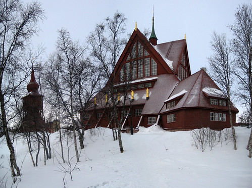
Kiruna certainly knows how to design for winter. Their church, or kyrka, has long sloping roofs that are not only lovely, but also handle large amounts of snow quite easily.
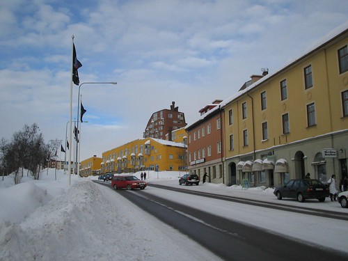
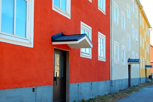
Months and months of snow and ice mean a landscape of white and grey. While lovely in itself, color becomes an important factor. The warm colors used on the buildings in the city center of Kiruna become even more vibrant in winter.
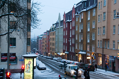
Even Stockholm, at the southern end of Sweden, whose winters are not nearly as ruthless, emphasizes color in the city.
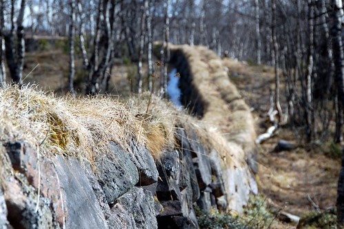
The texture and form of a simple stone wall can provide subtle beauty to the landscape, especially in winter.
More findings to come….
A New Focus
Posted by Adrienne on November 3, 2012
I began this blog way back in 2007 with a three-fold intention: 1. get to know the Twin Cities better by visiting, and writing about, independent coffee shops in the metro area, 2. practice my writing, and 3. get into graduate school. It worked well for those purposes and I received encouraging feedback about the blog from many readers (thank you!). Obviously it’s been awhile since I’ve written here, again for three reasons: 1. I got into graduate school, 2. I was very busy while in graduate school, 3. I’ve since graduated and my interests in writing have changed. Coffee shops no longer hold my curiosity as a subject matter, but they are certainly great places to get some work and writing done (for example: I’m sitting in Peace Coffee on Minnehaha Avenue – love this place! Also wish they had more evening hours….).
Since graduating with a Masters in Landscape Architecture in 2010, I’ve been working as a research fellow at the Metropolitan Design Center in the University of Minnesota’s College of Design. We function as a small think tank/consulting non-profit, assisting communities and cities in the metro area with research, planning, and conceptual design on urban design projects. We’ve worked on streetscapes, parks, housing, greenway plans, and many other issues. I get to do research, create graphics, design a bit, and help with community workshops. I love what I do and I’d like to keep doing it.
My favorite part, aside from knowing that we are helping communities make good urban design decisions, is the research. I love immersing myself in interesting topics, figuring out how to communicate my findings to other people, and seeing how what I’ve learned can make a difference in real ways. For example, in 2011, we worked with a Minneapolis neighborhood to reduce crime in a nearby park. I got to research how crime evolves in parks and how neighborhoods can fight back. In a nutshell, we discovered that busy parks are safe parks and that neighborhoods need to “take back” their parks by making their presence known and using the space. Since learning this, the neighborhood has started a non-profit dedicated to the park and has programmed weekly events in the park. MPR did a story about the changes the neighborhood has made. I’ve heard that since then, crime has greatly diminished in the park.
This experience convinced me that research does not have to be a frivolous pursuit by a nerdy person sequestered in an academic vacuum that never sees the light of day beyond a library. It can have real and lasting impact on real world problems. And that is what interests me. That is what I’d like to continue doing.
While doing research, I come across many amazing resources, fascinating tidbits of history, and interesting facts or ideas. This collection of articles, photographs, graphics, and ideas about cities, culture, history, and the environment are just gathering digital dust in my computer. So I’d like to share some of what I’m learning here on Cafeapolis, because others might find it equally as interesting – or maybe even life-changing, who knows. In many ways the blog is for me: to help me practice my writing and to have a display case for what I find. If it is successful and evolves into something really worthwhile, I may transport it to a “real” blog with its own name and intent. But in the meantime Cafeapolis will now function as my virtual workspace and fun informal project. You are welcome to follow along with me!
Quick thoughts on the Riverlake Greenway
Posted by justinph on June 12, 2011
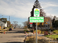 Yesterday the Riverlake Greenway opened. I didn’t make it there for the opening festivities, but managed to bike down the entirety of it shortly thereafter. Overall, I’m a fan of any plan to highten awareness of bicycling and promote safer streets for cyclists. I especially love the bump-outs (aka corner curb extensions) that were added along the way.
Two things about the greenway could use improvement, though.
First, the signage directing bikers north up Nokomis Ave from 42nd to 40th could be better. There is a sign, but it could also use some painting on the road. Overall, this isn’t a huge problem.
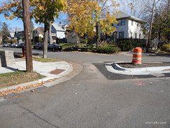 Secondly, 40th west of Hiawatha could use a lot less stop signs. When I hear the word Greenway, I think of the midtown greenway, a blissful 4 mile expanse with only a handful of stop signs, most of which cars will actually stop for you at. The Riverlake Greenway, however, seems to have just as many stop signs as any normal residential street. Especially appalling are the stop signs at the diagonal diverters (where cars have to turn, but bicycles can go straight). A highway for bicycles the riverlake greenway is not.
Sad news…
Posted by Adrienne on January 12, 2009
Back in August 2007 I reviewed our favorite neighborhood coffee shop, the Clicquot Club Cafe. Just found some sad news online that says the cafe is closing due to the bad economy. Tonight is the last night they will be open.
It’s hard to believe Clicquot was having rough times because every time I would go there on the weekends they were packed! But I guess looking back, I remember some very slow weekday evenings. Plus it’s a small place, so it’s probably difficult to find seats on winter weekends. It’s really a bummer – they were the epitome of a small friendly neighborhood coffee shop. I wonder what will happen to that cute little building? What else could end up there that would possibly help to create a vibrant neighborhood? And if a place like Clicquot can’t survive in a neighborhood like Seward, what hope does it have elsewhere?
Campus Option 1: Bordertown Coffee
Posted by Adrienne on January 10, 2009
This is the first in a series of posts exploring coffee shops near the University of Minnesota, since this is where I spend the majority of my time. I’ll start with the East Bank, but also check out the West bank and the St. Paul campus as well.
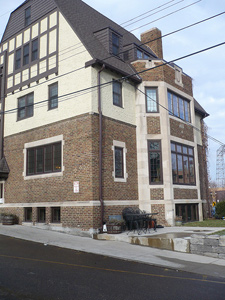
Students at the U have a LOT of coffee shop options on campus; many of them are independent, many are not. My favorite on-campus coffee place is the French press on my studio desk, but when I want to get away from a project I head to Bordertown Coffee. It occupies the first floor of a beautiful old brick and timbered building hidden behind Frat house row on University. To read the full and fascinating story of how the owners acquired the building, read their website.
I love the warm cozy feel of the main sitting room, complete with armchairs and stone fireplace. This room is frequently busy during the lunch hour but most times you can find a small table. There is an additional smaller sitting room on the main floor which can be reserved for free as a conference/study room. Apparently the upper floors contain some sort of student housing, perhaps another fraternity or co-op.
The website mentions the cafe’s owner’s Christian beliefs, but I was pleased to note that the cafe did not advertise this fact; I’ve witnessed several blatantly religious coffee shops that were a bit of a turn-off.
The Fair Trade coffee and espresso are quality, and the homemade bakery items are usually delicious (I loved the dark chocolate nut bars but was not crazy about the vegan blueberry muffins). For lunch options, I wasn’t impressed with either the quiche or the basalmic chicken wrap, but maybe I’ll have to give some of the other breakfast items a chance. The hummus and pita is a nice snack option, but I’d ask to have the pita toasted – cold pita not so appetizing.
So if you find yourself on campus in need of a cozy coffee shop, sneak behind the frat houses and see if you can locate this little treasure. Bonus points if you can figure out a way to get there via the underground campus tunnels!
WiFi and desktop vampire re-defined
Posted by justinph on January 8, 2009
Adrienne and I went to 2nd Moon tonight to do a little reading and computing. We sat in the back, which we had never done before. It was very nice and cozy.
As we walked in, we saw this fellow sitting near the front:

A guy working on a 20″ iMac.
Apparently, we’ve moved from just using laptops in cafes to using entire desktop computers. No doubt, the iMac is very easy to cary and plug in, but it seems a just little excessive to me. I think there is a point at which computing in public is not OK, especially given Blue Moon’s already noted problems with people working for too long.
Unless you own the coffee shop, this is socially unacceptable behavior.
What makes a public space popular?
Posted by Adrienne on August 27, 2008
Here is a back-to-school quiz.
Where would you rather hang out:
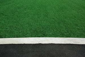
A) On a fake turf-covered lawn, or
B) In a landscape architect-designed plaza complete with fountains, vegetation, and benches?
I imagine most people would pick B, wouldn’t you? What would you predict other people would say?
Turns out it may not be that obvious. This article found on the American Society of Landscape Architects’ blog compares several public spaces in a DC suburb with surprising results. The beautiful plaza was indeed packed on a summer evening, but so was the fake lawn nearby! Locals had adopted the astroturf square as an impromptu park.
So what’s going on here? What we don’t know is whether this is the norm or maybe if the area was so packed on this particular special occasion that people were just plopping down where ever they could. Was the plaza packed because of the show going on, or is it always full? Or maybe it has mainly to do with the fact that there was a place to eat near the lawn.
It’s not easy to get a real picture without data like this, but the question has been asked: what kind of public places are most popular? Clearly it is not solely a function of the quality of the design of the space. How important is design then? Or, what kind of designs would appeal to the most people? Or maybe it’s more about the context of the space. It goes without saying that even a prize-winning design will see few visitors if it’s in the middle of nowhere.
I once read about a grassroots design strategy that looks at current uses of a public space and then designs the new space to better address those uses. For example a public park was used by a group of persons for drinking during the day. Some people might have a problem with this (illegal?) activity. But the designers saw that this was a real use in that park and, rather than judging the morality of the issue and reprograming the space, designed an informal beer garden that would provide a legitimate place for drinking. In this way they were respecting the local citizens and creating a distinctly local place to serve their needs.
Now I’m not saying we should install beer gardens in all parks (though it might be fun), but maybe this example could give us a new way of looking at designing public spaces. Instead of programming a plaza in a way we THINK the public might want, what if we asked them or observed current behavior to find out how they might actually use it. I know this isn’t a new idea (public charrettes are common steps in today’s design process) but this is where landscape architects might need to put aside their idealistic tendencies and consider pragmatic results.
It’s an ongoing discussion that provides endless questions. Any thoughts?
How walkable is your neighborhood?
Posted by Adrienne on May 24, 2008
We came across a fun and eye-opening tool today that measures the walkability of a location. Check out Walk Score: enter an address and see how it scores. Our new apartment scores an 80 out of 100. Not bad!
Especially in light of the high gas prices, it might be helpful to re-think where we choose to live and why. What is the most important factor in making that decision? Amount of green space? School system quality? Distance from work? How will this change or stay the same in the coming decades? At what level in gas price will walkability become a factor once again?
© Copyright 2006 Adrienne Bockheim.
